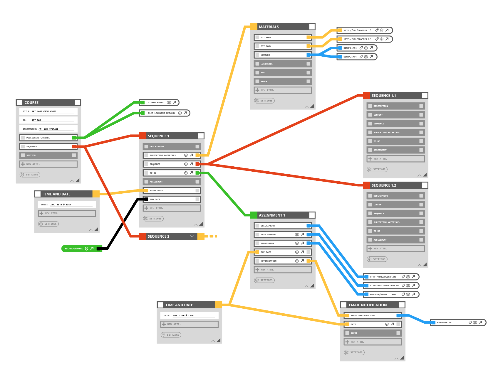
Configuration nodes
2018I’ve always been frustrated with how far behind the UI for creative web software/apps seem to be. More sophisticated UIs are now emerging, but they are not ubiquitous. For instance, configuring an online or hybrid course requires visiting many pages or unique URLs the in whatever learning management system (LMS) is being used. It’s laborious and most LMS software is half-built and are confusing to use. These node UI experiments are an unfinished attempt to show how a person can gain mastery in fast course configuration, while at the same time seeing a visual map of the course itself. The idea is that this type of UI is available in addition to menu based navigation and configuration. I took inspiration from node editors prevelant in all in 3D animation software like Maya and C4D, Rhino3D Grasshopper plugin, game development environments, and other similar interfaces. The Node-Red project is probably the best or most accessible web based example, but their editor is not abstracted from the platform, so it is not re-purposable as far as I know. A “Bootstrap for nodes” is needed so that other developers can take advantage of this interface in their projects. If the configuration of the course can be abstracted from the presentation of the course, you can essentially get a UI for “headless” course configuration.

