HAX CMS UI Design Study
2019Tools: Figma
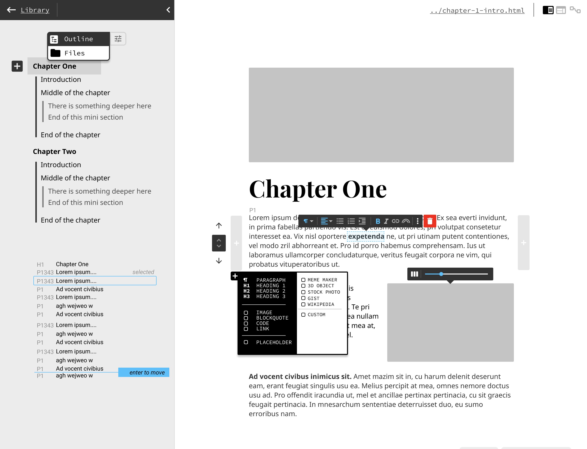
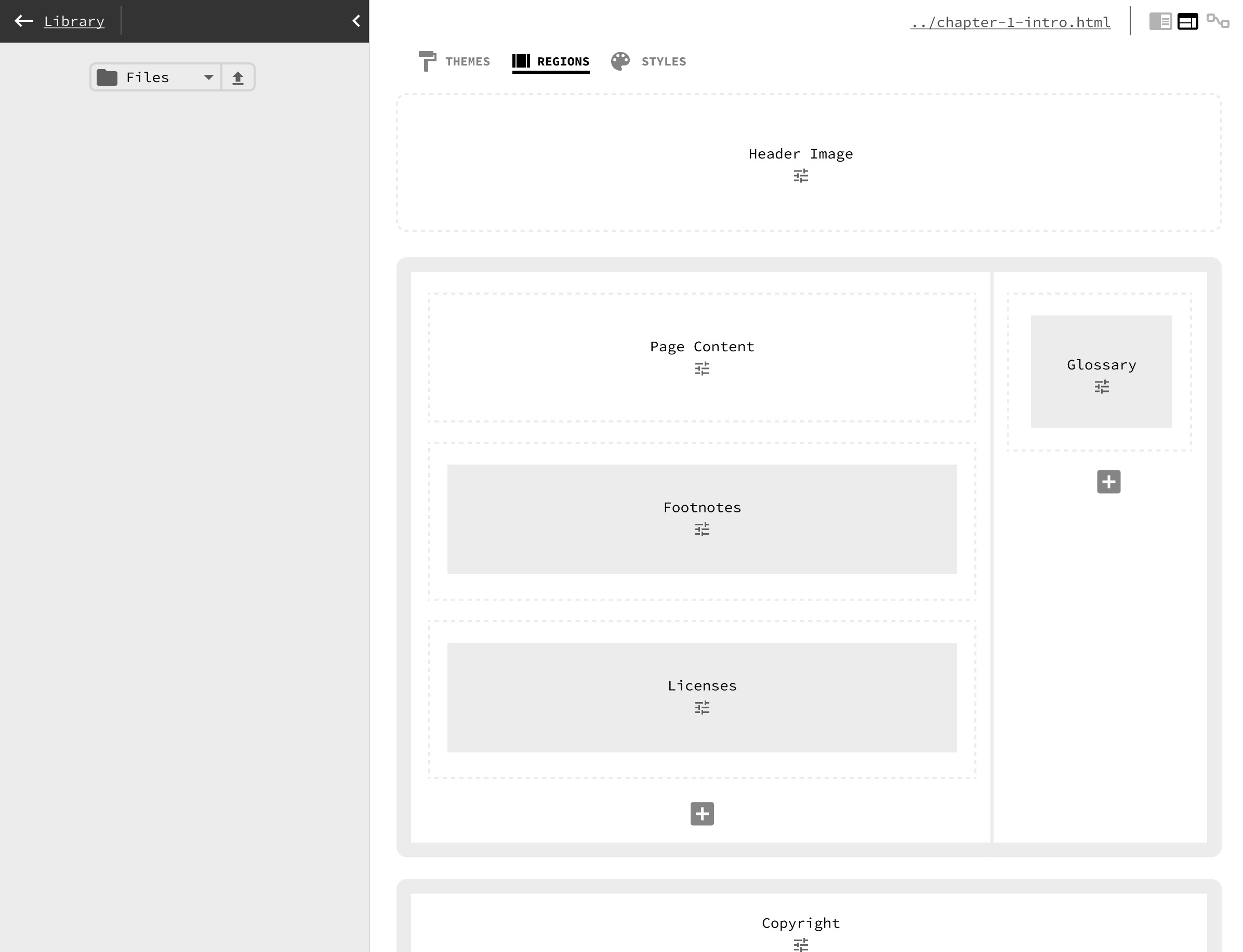
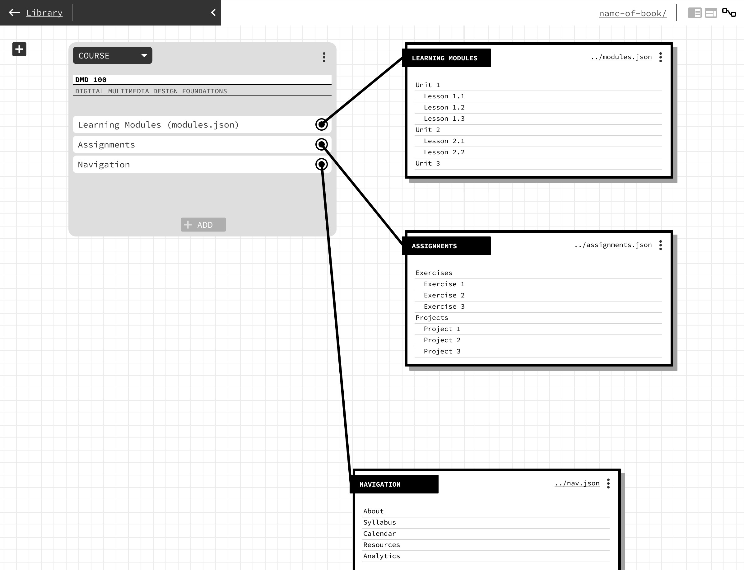
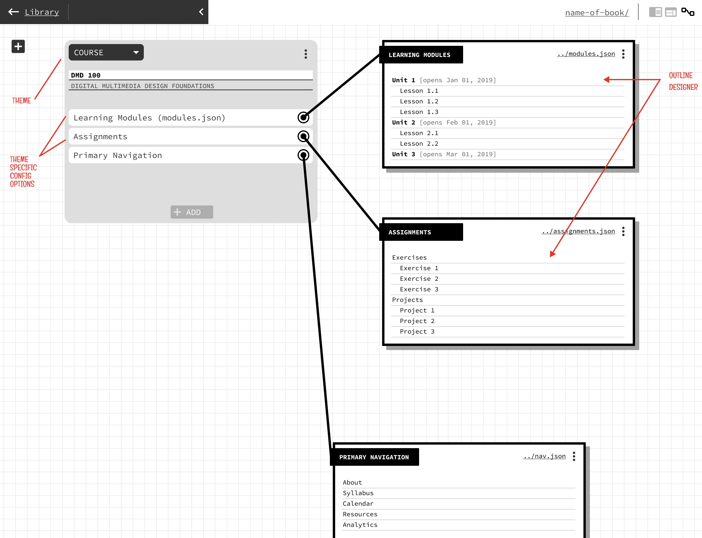
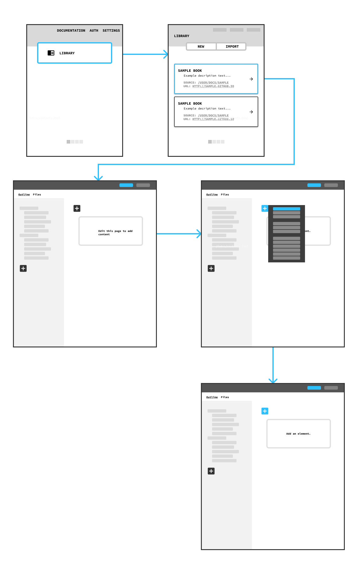
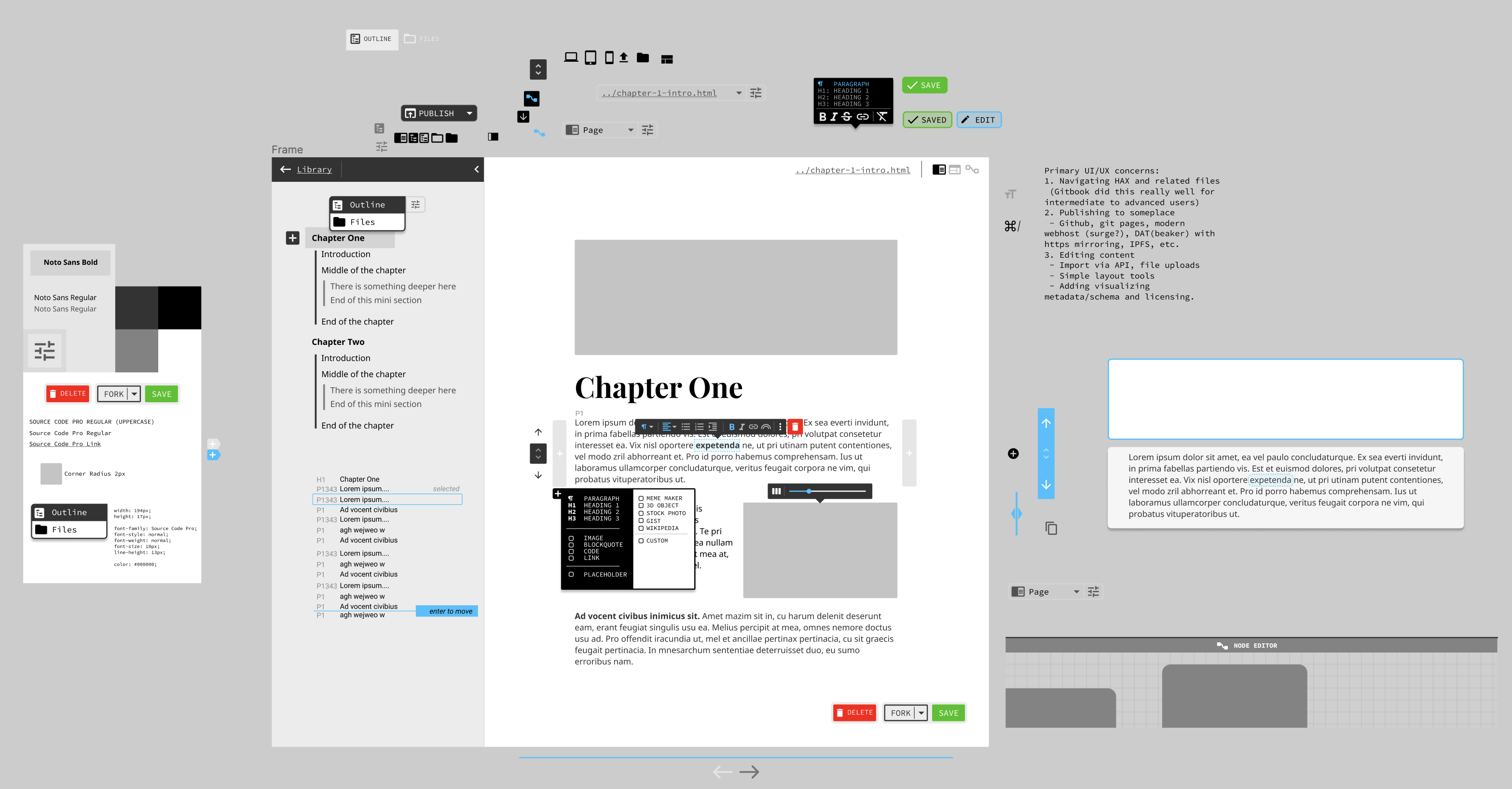
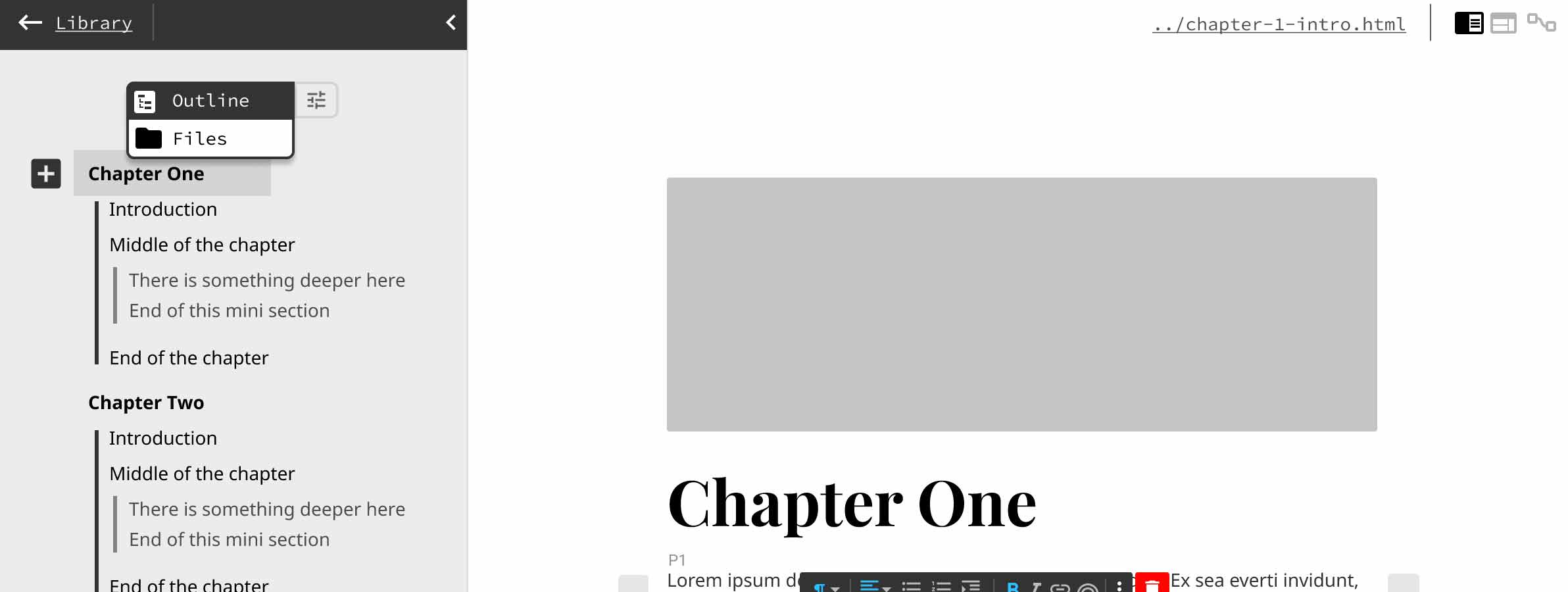
For this project, I took inspiration from several interfaces including Figma itself, legacy Gitbook.io, and a few earlier designs that never saw the light of day. The interface was intended to be a way to operate HAX CMS, which stands for Headless Authoring eXperience Content Management System. HAX is essentially a WYSIWYG editor on rails that can also add any type of media to a page using web components to access the APIs of various services, like Youtube or NASA images. The CMS relies on the OS file system and is essentially a static site generator. My favorite aspect of HAX is its ability to add arbitrary metadata to individual objects and text, making HAX one of the most powerful text editors, allowing users to author and publish semantic web content as though you were typing a Word Doc. This description is an oversimplification, but it’s a fascinating project.
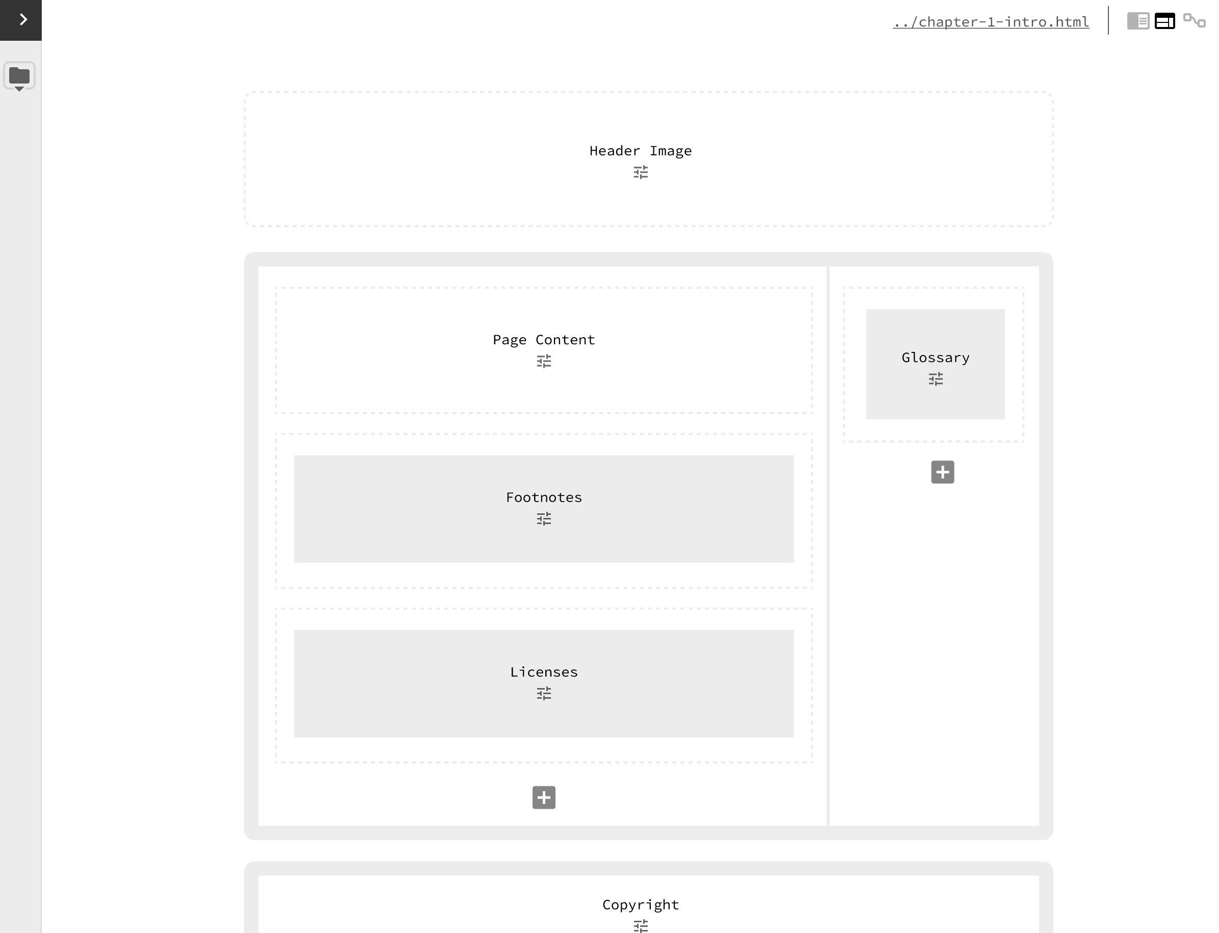
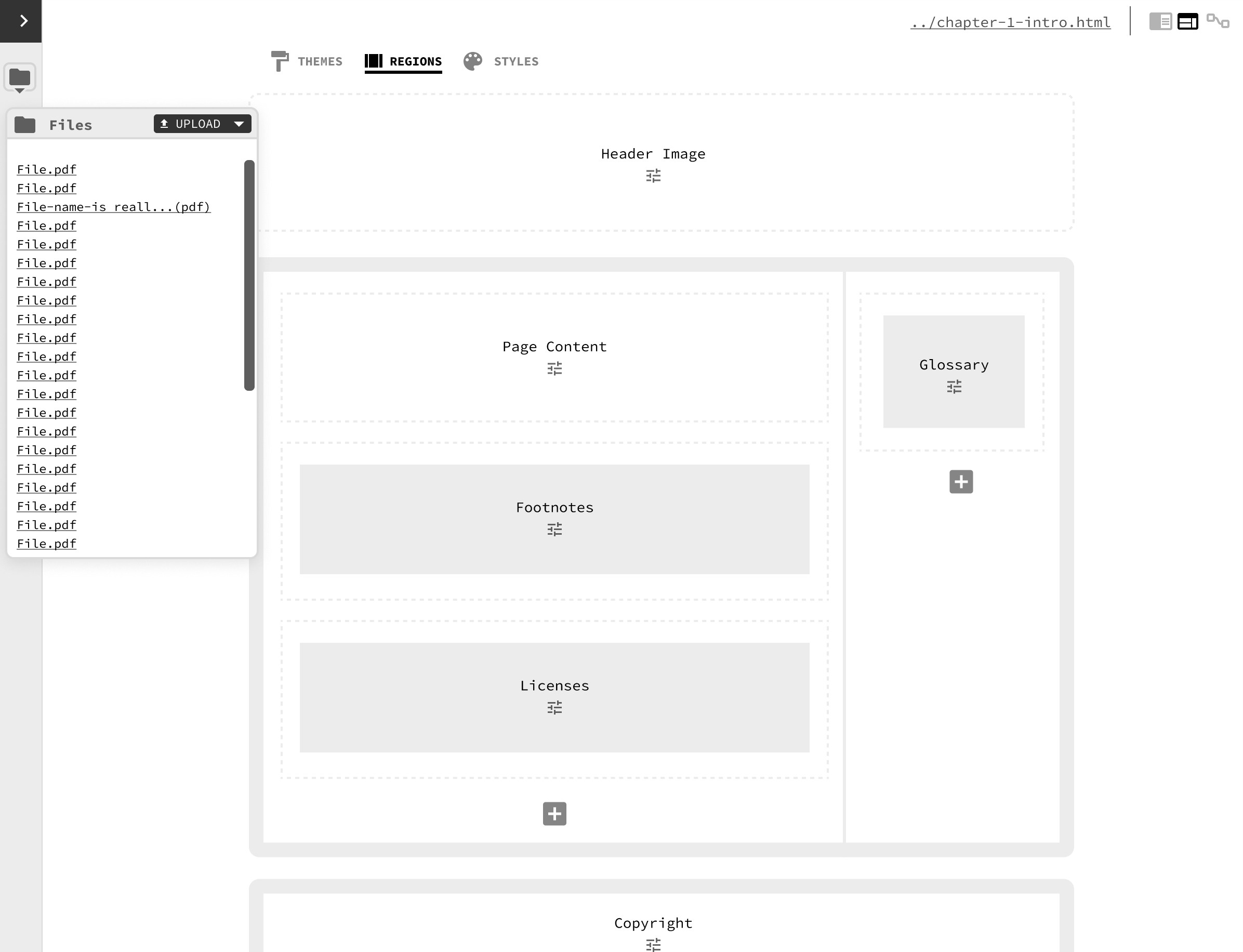
The designs I created show three main editing modes: “Book”, “Theme”, and “Meta”. They show ways to edit content using a HAX editor UI, how to organize HTML pages as you would a book, configure regions, layouts, and styles, create navigation, file uploads, and shows a node based configuration editor that would allow a user to bring context to their book. For instance, if it were an educational course, you could use this node editor to create semantic relationships between content and navigation to communicate this information via the web. The design was never fully developed, but helped generate a lot of discussion in the issue queue.
The HAX project can be found here: haxtheweb.org
